 |
Site created 12/15/97.

page created: 7/17/02
 Robert A. Harris - Main Page |
Vinegar Syndrome is a Gas, Gas, Gas Like the Four Horsemen of the Apocalypse, one of the plagues affecting motion picture elements is vinegar syndrome (VS). Where one can have nitrate decomposition on older stocks which have not been well cared for, and decomposition in early safety tri-acetate stocks (in which the base breaks down), we have vinegar syndrome for all acetate based safety stocks - inclusive of both audio and picture elements. What does this mean and how does it affect film restoration? A film element with VS will shrink, off-gassing acid as it deteriorates, sometimes leaving a perfectly good emulsion layer unusable. The process will sometimes self-start, but in most cases it makes itself known when an element is improperly stored (think South American or Floridian conditions) with high temperatures and humidity, has not been properly washed during processing (leaving unwanted chemicals still imbedded in the film), or after rejuvenation - a chemical treatment used for scratch removal on release prints. On occasion, some wonderful individual has actually used treatment on original negatives. Once VS begins, there is little that one can do to stop it. It can be slowed via lower temperatures. The film can be stored in sealed bags with chemical sieves, which will literally eat up the off gassing. Or it can be stored in vented containers, allowing the gasses to escape. One additional problem is that VS will spread, contaminating other film elements. The extant 70mm print of The Alamo, as well as the majority of deleted scenes from It's a Mad... World, have VS. Several months ago, Ron Epstein photographed a roll of affected Mad World material and it should still be available on HTF. Once the condition makes the element unstable, it will shrink to a point where it cannot be replicated, before it eventually turns to a wonderful sticky gob and, finally, highly delicate dried film, which self-destructs when touched. A Few Notes on Grain Structure, Black and White Film Stock and How They are Represented on Home Video Early black and white stocks, going back to the late 19th century, had a much more coarse and granular grain structure than their modern counterparts. Not that the early emulsions couldn't be the palette for magnificent images - they were just grainier. First or second-generation print elements derived from these stocks can still yield superb results in current transfers. They just look different. As a guide, take a look at some of the early Chaplin titles, which were overseen by David Shepard for Image Entertainment. Some of these titles are so well transferred, from such beautiful materials, that we now see things Chaplin never intended us to see - things, in years past, that would have been lost in poor optics and film grain. Film stocks got progressively better, with higher speeds and finer grain. They allowed for photography under lower light levels. Contrast ranges also got better and images looked cleaner. That said, I must give warning that once you get past a couple of film generations, those beautiful black and white images, whether reproduced originally in a palette of soft grays, or in the more contrasty form of stark black and whites, will begin to look not only overly grainy, but like bad dupes of King Kong, in which all that is seen in close-ups are eyes and teeth. I've said in the past that grain is our friend. It is the basic structure of the filmed image. It just needs to be represented and reproduced properly. And as I'll go into a bit later, that grain is what helps to identify films as film. Some of the more recent transfers of some very high profile films, such as Snow White*, Citizen Kane and North by Northwest*, have been digitally cleaned to a point where the film grain has been removed, yielding an almost shiny, grainless image. I'm not saying that these transfers are bad. They're not. It's just that they're different, and not representative of the actual film. They are, for all intents and purposes, a modification of the film into a fully digital, video product. And some of them can look quite lovely. In the early days of the cinema, all prints were derived from the original negative until it simply wore out. Negatives were re-cut for different versions of a film. Foreign versions would be constructed of second and third quality takes. Fine grain-duplicating stocks (also known as "lavenders") arrived in the 1930s, allowing the original negatives to be preserved and duplicated for future use. Kodak released its first commercially available roll stock in 1889, but it was not until 1922 that panchromatic stocks (capturing the visible spectrum) and dupe negative stocks were released. Until that time, with the use of orthochromatic stocks, film was incapable of capturing the entire spectrum of light. In motion picture design, scenic elements, costumes and makeup were structured in various colors to make them look proper on film. In the 30s, faster and finer grained stocks appeared, along with the first real fine grain duplicating material, leading to early preservation and quality duplication. Plus X film (a black and white staple) appeared in 1938, to be quickly replaced in 1941 with 5231. In 1950, the changeover began from nitrate to safety-based films. The nitrate stocks had an absolutely clear base, which came into play especially with Technicolor prints. Safety based stocks had an off-clear color, usually yellowish. In 1954, Tri-X 5233 (high speed camera negative) arrived. In 1956, along came the new Plus-X 4231, later 5231. 1958 gave us a new dupe negative stock, 5234. And in 1959, Double-X 5222 appeared (a higher speed negative stock). Things progressed through the 1960s with even faster and finer grained stocks. If you sample black and white films from various periods, and if the transfers are from prime elements, the difference will be quite discernable. There are major films which survive today at best in third generation elements, as both the original negatives and fine grain positive duplicating master are just... ...gone. Compare, for example, Criterion's release of 1934's The Scarlet Empress*, most likely derived from a third generation element as an earlier stock, and Paramount's release of John Ford's 1962 The Man Who Shot Liberty Valence*. Then compare Valence with Warner's recent The Women*. Photographed in different styles, you'll note that while The Women has the full range of grays, all beautifully rendered in the new transfer, Valence has a harder look, reproduced for higher contrast with rich full absolute blacks, as opposed to darker grays. You can compare these two to Universal's release of Hitchcock's Shadow of a Doubt*, and his later Psycho*: two totally different looking films. Films reproduce in different ways. Compare James Stewart's jacket (with its rich blacks) in the opening of Valence to the representation of black in a 3-strip Technicolor film, the 1948 The Red Shoes*. In an early scene, the impresario (played by Anton Walbrook) is shown in a formal dinner jacket. In original prints of this film in Technicolor, there is a distinct differentiation between the wool of the jacket and shinier satin lapels. In the DVD, because of the quality of the elements used to create the transfer element (well out of the control of Criterion), all you see is black. Speaking of Criterion, another Powell/Pressburger film worth owning in the 1945 black and white I Know Where I'm Going*. While we're on black and white, you'll find another interesting example from 1965 in Otto Preminger's In Harm's Way - a huge production with an all-star cast, and one of the few black and white films to be blown up from 35mm Panavision to 70mm for release. As an aside, when I suggest DVDs I feel merit your viewing, I'm not suggesting that you purchase them all. There are certain titles that I would suggest as part of a collection. When I feel that these are genuinely worth your putting out funds to acquire them, I'll generally say so. As a guide, these titles will be followed by an asterisk when mentioned. I would suggest the addition of Valence*, Red Shoes* (for those of you who don't yet own it) and Scarlet Empress*. In Harm's Way is a good rental item and is suggested as such. Another superb black and white film which was recently restored - a beautifully done restoration job which was a joint project between Fox's Schawn Belston, UCLA's Bob Gitt and the Motion Picture Academy, with laboratory work handled by Paul Rutan of Triage Laboratories - is another John Ford film, How Green Was My Valley * , the Best Picture of 1941. Rather than using the standard fine grain stock, Belston came up with the concept of using Eastman separation stock 2238, purposing it for something other than its official design. And speaking of films worth purchasing, there are a few more for your consideration (including a recent release which has made its way from theatrical distribution to its gathering of Academy Awards and quickly out as a DVD special edition). We're in a rather extraordinary time. For the last 75 or so years, The Academy has made its pronouncements of Bests, only to have them disappear from our landscape, sometimes hardly surviving. But with laserdiscs (and now DVDs) as the new collectors' medium, these films are finally available to us in editions which mirror their artistic value. One such title is the new A Beautiful Mind* (widescreen version) from Universal. With a perfect transfer and a good representation of extra elements, this is a Best Picture that should be acquired. If you think back just a few years, you'll see how long it took for Best films to make their way to us in top quality editions. Universal's speed in releasing Ron Howard's film (especially coming after the late 2000 release of Gladiator* on a timely basis as a special edition) is hopefully a harbinger of things to come. Keep in mind, that Best Picture releases from the past twelve years are only represented by eleven titles. And of those eleven, only seven are in special edition form. Unforgiven is coming in the near future, along with a new version of Dances with Wolves. But going back to previous decades, we can find hardly any special editions of these great films. There have been lists made of what Best Pictures are available on DVD. An interesting addition will be to find out just how many Best Actors, Actresses, Color and Black and White Cinematography and Editing awards are represented. While we're on new releases, I'm also going to suggest the purchase of two other titles. First, O Brother, Where art Thou?*. The special edition of the Coen's film has been turned into a great DVD with the inclusion of myriads of extra materials, inclusive of another short by Eric Young, who was the DVD producer of the Disney Vault series. In O Brother, Young takes us on a tour of the digital process which allowed the Coen's and cinematographer Roger Deakins, who also photographed Beautiful Mind, to bring us the dustbowl images via Kodak's CineSite facility. This is another quality technical short, which does a superb job of explaining the technical and making it understandable. The other recent DVD release, which I never thought that I would be recommending, is that other December 7th film. Not In Harm's Way, but the Pearl Harbor: Vista Series* edition. Viewing Michael Bay's cut of this film has not changed my mind about its inherent script problems. But one element that this film possesses is the bravura attack sequence, lengthened in this cut, that should be setting CGI standards for future releases. On top of this - in a four-disc package - we are offered multiple technical tours behind the scenes, taking in varying levels of pre and post-production, explaining just how this sequence came to be. And that folks, at $28 and change delivered, is $7 a disc for the set - well worth the price of admission to anyone with an interest in film production with digital technology. It could only have been made better if Mr. Bay had taken the interview and discussion process a bit more seriously. How many times is it necessary to listen in while he chides his associate about possibly being out of work or whether he'll hire him for a future project? While it's nice to be able to meet some of the folks who (in the past) have simply been names in credits, hiding behind the camera, I do believe that the audience's time might be put to a bit better use. Still, these discs do offer a great deal of valuable information. More Than a Few Words on Aspect Ratios 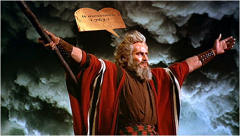 Photo courtesy: Paramount Pictures, Widescreen Museum and Mr. Heston At its most simplistic, an aspect ratio is just a shape. In film, it becomes the proscenium arch surrounding the presentation. In the very early years of cinematography, there were a number of different aspect ratios, most rectangular. The ratios varied from virtually square to large format wide screen. Things settled down in the teens with what we now consider to be the classic Academy ratio of 1.33 - 1.37:1. When films shot under that classic scheme were presented in the mid-1950s, they were generally cropped at top and bottom and presented as a slightly wider image. Thus the many films are considered proper at 1.66:1. This change came along concurrent (and because of) CinemaScope, which originally had an AR of 2.55:1 in its magnetic form -- later 2.35:1 in its optical format, with the optical track taking over the left side of the image. Sometimes, this image was optically shifted and centered. In other instances, such as Bridge on the River Kwai*, the left side of the image was unceremoniously lopped off - only to be finally corrected on the present DVD from Columbia. Films photographed on 65mm film were set at an AR of 2.21:1 or (if photographed anamorphically as It's a Mad… World) at 2.76:1, and were projected in 70mm at anywhere from 2.55 on up to 2.76. But no matter what the AR, it was the intent of the director of photography and the film director to have the final product projected as closely as possible to not only that ratio, but with as much of the image retained on screen as possible. There are specific guides in projection (test loops can be used in the cutting of apertures) which help hold these standards in place. But there isn't much to be done in retaining picture information when a projection booth is 175 feet away from the screen and two stories above. Remember that flashlight and the cutout squares you made last week? If you tried that experiment, you should now have some understanding of how much better films can be (and in most cases are) presented on DVD than they are in theatres. On occasion, things can go terribly wrong in a film to video transfer, and the wrong AR can be used. This generally occurs when transfers are produced from a Super 35 element, which can provide any number of different ratios, cropped in many different ways. Or, one can go to extremes and choose which way a film should run on your home setup. Transfers of a number of James Cameron films have been made available in both open matte and 2.40 aspect ratios. Is one more correct than the other for video? I don't believe so. One represents the theatrical version of the film. And then we have aspect ratio modifications - "modified to fit your screen". The panning and scanning of scope productions arrived with a need to broadcast the early wide screen productions on TV and to make them available for 16mm non-theatrical venues incapable of screening CinemaScope. While I personally would prefer not to view a panned and scanned version of a film, they are necessary. Not a necessary evil - just necessary. The studios are in the BUSINESS of filmmaking. While the business and the art of it can sometimes co-exist, the business will generally win out. And because it is a business, the studios have the obligation to maximize the earning potential of their product. If this means panning and scanning a film for television (or for those who prefer) it as a representation for home video, so be it. And as long as proper widescreen OAR versions are available to us for home theatre, there really isn't a problem. I'm certain that some will disagree with my stance on this issue, but in reality it shouldn't be an issue. As DVD breaks more ground in terms of numbers of units, hopefully those studios which have seen fit to only release non-OAR versions of titles of "general release" or "children's" product will see their way to creating proper OAR releases. Probably the most egregious of these to my mind has been MGM's original DVD release of Ken Hughes' film Chitty Chitty Bang Bang. [Editor's Note: I have it on good authority that there is serious talk at MGM about revisiting this title on DVD in the near future.] Now then... let me make a final note on film grain and how it relates to digitized images, and also of the loss of that "film" look in some releases. We've come to a point where, with technology, we can make film look like video - and this isn't a good thing. Film has grain and "sparkle," and always did. Now, grain is being removed digitally, leaving with what I consider a dead look. And "sparkle" - those tiny bits of imbedded dirt which appear as tiny white spots here and there - is also being removed. What's worse is that we are now being given, as added extras, nondescript images of film before and after its "restoration." A recent example is Z* from Wellspring. This is a truly great and politically important masterpiece of a film, which just doesn't look as good as it should, even though we are treated to a "restoration" demonstration. On the other hand, we have a recent release from Sony -- Columbia Pictures reconstruction of 1776*, which has been beautifully rendered and left to look like... ...FILM! 1776 has a great image, inclusive of "sparkle." And while I don't agree with some things that Columbia TriStar Home Video has done, they've done right by 1776. When they're right and do a great job, they should be commended for it. So there you have it. Robert Harris --- Don't forget - you can CLICK HERE to discuss this article with Robert and other home theater enthusiasts online right now at The Home Theater Forum. And speaking of that, thanks to the HTF's Ron Epstein for the picture of Robert seen in the column graphic above. |
Robert A. Harris - Main Page

| Site
designed for 800 x 600 resolution, using 16M colors and .gif 89a
animation. © 1997-2015 The Digital Bits, Inc., All Rights Reserved. billhunt@thedigitalbits.com |